
Hello, welcome to my project portfolio

I am Data/Business Analyst with experience supporting decision-making in regulated, high-stakes environments, including public sector organisations, utilities, and healthcare-related analytics. I specialise in transforming complex and sensitive data into clear, defensible insights that leaders can trust when making operational and financial decisions under pressure.My background combines analytical rigour with frontline and stakeholder-facing experience, allowing me to interpret data within its real-world context. I have worked closely with operational teams, customer-facing functions, and senior stakeholders, ensuring that analytical outputs are accurate, ethical, and genuinely actionable.I bring a strong focus on data integrity, governance, and validation, particularly in environments subject to regulatory scrutiny and audit. My work supports service efficiency, resource allocation, and risk-aware decision-making, with an emphasis on clear communication for non-technical audiences.With training in economics, finance, and energy policy, alongside hands-on analytical delivery, I offer a systems-level perspective on how data underpins sustainable service delivery and financial resilience. I am seeking analyst roles within organisations where reliable data, sound judgement, and stakeholder trust are essential to improving outcomes.
Skills

Excel | Power BI | Tableau | Python | SQL | GAMS Modeling
Advanced Excel 5+ years
Financial Modeling 3+ years
Capital Budgeting 3+ years
Statistical Analysis 3+ years
Risk Assessment 3+ years
Energy Markets 2+ years
Welcome! Click Arrow to View My Projects
Featured Projects
Emergency Department Demand and Capacity Analysis to Support Resource Allocation
Power BI | Exploratory Data Analysis | DAX
Track patient admission and discharge patterns.
Identify predictable pressure points that can inform service improvement initiatives.
Optimise resource allocation by understanding hospital performance.
BANK LOAN PERFOEMANCE ANALYSIS
An Excel-Based Analytical Dashboard for Monitoring Loan Quality, Risk Exposure, and Portfolio Health

Microsoft Excel (Advanced) | Pivot Tables | Financial KPIs | Dashboard Design
This Project evaluates loan portfolio health by distinguishing good and bad loans, tracking repayments and identifying credit risk patterns.
Expect executive-level KPIs, loan quality segmentation, geographic risk analysis, and month-on-month performance insights.
EXPLORATORY DATA ANALYSIS USING PYTHON TO ASSESS THE VOLATILITY OF OIL PRICE
Why is this project necessary?
Demonstrates practical Python skills (pandas, NumPy, matplotlib) in real-world energy data analysis; turning raw data into actionable insights.
Highlights my ability to analyse market behaviour, quantify risk, and communicate findings clearly with both data-driven evidence and visual storytelling.
For oil & gas companies, this specific investigation provides insight into market uncertainty and risk management, supporting better planning for investment, trading, and long-term strategy.
Python
Pandas | Numpy | Matplotlib
project summary
Investigated why oil prices are often labelled volatile by linking observed price behaviour to underlying events such as financial crises, oversupply, and geopolitical shocks.
Collected historical oil price data from the U.S. Energy Information Administration (EIA) using pandas for structured data handling.
Computed log returns with NumPy to quantify fluctuations and assess volatility beyond raw price levels.
Visualised trends and shocks with matplotlib, confirming the common assertion that “oil prices are volatile” by highlighting sudden spikes and crashes.
Capital Budgeting Appraisal Of Oil And Gas Prospect Using Advanced Excel (Financial) Modelling
Conducted Comprehensive risk assessment and sensitivity analysis using Monte Carlo Simulations
Leveraged deep industry knowledge in energy markets to support strategic planning and policy evaluation in uncertainty to achieve commercial objectives.
Developed Financial forecasts to assess the feasibility of an oil and gas prospect for Transition Energy Ltd.
Applied Predictive Financial Modeling to assess feasibility of NewFoundLand Field Using Advanced Excel Techiques, Making use of Range Names for easy calculations.
Applied Storytelling to Create Written Report Highlighting findings.
Created Visual Presentation from my Analysis Results.
Excel | Capital Budgetting Appraisal
INVESTIGATING THE EFFECT OF THE UK EMISSIONS TRADING SCHEME (UK ETS) ON INVESTMENT DECISIONS AND TIMING OF DECOMMISSIONING OF ENERGY PROJECTS IN THE UKcs
Summary of Project
This is my MSc Energy Economics and Finance project.
This project was done in collaboration with the Offshore Energies UK (OEUK).
Given that drive to net zero should be a global fight, this project was to assess the impact of the UK ETS on decision to invest in the UKCS, including its potential influence on when existing companies decide to cease operations.
The results underscore the critical role that oil prices play in the decarbonisation drive.
Excel | SQL | Power BI

Summary of Methodology Used
To achieve this objective, I conducted a capital budgeting appraisal of three (3) representative fields of different sizes in the UKCS using Advanced Excel (Financial) Modeling.
I used the Net Present Value (NPV) and Cessation of Production (CoP) to represent profitability and timing of decommissioning respectively.
A Monte Carlo Analysis was used to assess the risks and uncertainties resulting from variations in carbon price and oil price on NPV and CoP.
Some Key Findings
The deterministic analysis showed that Carbon Prices resulting from the UK ETS has a negative effect on profitability of investments in these fields and tend to shorten their lifespan.
The impact is very insignificant for large fields but has pronounced effect on small fields.
It was established that Oil price volatility exerts a significantly stronger influence on field profitability and decommissioning timelines than carbon pricing; even substantial increases in carbon prices have minimal impact unless accompanied by a sharp decline in oil prices.
INTERACTIVE COMPANY SALES DASHBOARD - HOSTED ON POWER BI SERVICE
Summary of Project
Interactive sales dashboard for a pizza company to analyze sales trends, customer behavior, and performance KPIs.
The dashboard helps understand what drives sales; from busiest days to popular pizza types.
Designed for deep-dive exploration.
Why is this project necessary?
This project demonstrates how data-driven insights can help businesses make informed decisions. Though focused on the food sector, the skills are highly transferable across industries.
pOWERED BY Power BI, SQL & DAX
📅 JAN/15 – DEC/15
⚙️ Work in Progress

✅ Hosted on BI service: Clickable drill-down available for daily orders to view pizza category breakdown!
Key Metrics (KPIs)
Average Pizzas per Order: 2.32
Average Order Value: $38.31
Total Pizzas Sold: 49,574
Total Orders: 21,350
Total Revenue: $817.86K
 inspecting wind turbines. Wind turbines in the ocean, concept for wind energy, sustainability and")
Value to company/investors?
Help investors to assess the main risks to their returns.
Help assess the effect of the recent increases in electricity prices and inflation on profits whilst creating value to customers.
What options might the developer/investor consider to increase returns in an uncertain world?
Capital Budgeting Appraisal Of a Wind Farm Prospect Using Advanced Excel (Financial) Modelling
Built a spreadsheet model to obtain the NPV and other useful output values (metrics) of a country's first offshore wind farm prospect solely financed by joint venture (100% equity financing).
Calculated the Levelised Cost of Electricity (LCOE) and compared it to the government's Contract for Difference (CfD) to analyse the implications for the project.
Calculated the break-even electricity price and constructed a Tornado chart for key input variables.
Examined how the model and results will change if the project is financed by both equity and debt (Change in capital structure).
Used Storytelling to Create Written Report Highlighting Findings with Visual Presentation from My Analysis Results.
Excel | Capital Budgetting Appraisal
Renewable Energy Adoption in the UK - A regional Analysis Using SQL, Excel and Power BI.
Watch this space for my SQL project. (Project done. Loading soon...)
This project analyses data from gov.uk on energy consumption in the UK to make recommendations on renewable energy adoption, both national and regional level.
Excel | SQL | Power BI

Extra Professional Certifications
My growing list of proprietary, exam- and case study-based certifications

Joint Venture Contracts | 2024

Oil and Gas Transport & Sales Contracts | 2024
CLIMATE CHANGE ANALYSIS
A Tableau-Based Analytical Dashboard for Monitoring The Impact of Climate Change

Advanced SQL | Tableau | Dashboard Design
Built data pipeline to track climate change data in real-time.
Helps an organisation to analyse climate change patterns across multiple countries, suitable for corporations that dela with data from different sources.
Generated automated reports through a centralised dashboard, capable of providing on-demand insights.
ANALYSING THE IMPACT ON CLIMATE CHANGE ON ORGANISATIONAL DECISION MAKING

Project OverviewClimate change is one of the most pressing global challenges, and organizations require efficient ways to track its impact in real time. In response to this need, I designed and developed an end-
to-end climate change analytics solution that enables seamless monitoring and reporting through an interactive dashboard, hosted on tableau.
Problem Statement & SolutionA research institution needed a robust system to track and analyze climate change patterns across
multiple countries while ensuring accessibility through a centralized dashboard. Additionally, they required automated weekly reports and on-demand insights to support data-driven decision-
making.To address this, I implemented a data analytics pipeline that transformed raw climate data into
actionable insights:- Data Collection. This project uses synthesised data, covering seven countries (USA, Canada, Australia, Germany, India, South
Africa, Brazil) from 2024 to 2025. To ensure this project depicts real life data while ensuring proper data governance, I generated high-quality climate data using AI-
driven tools using clearly defined and high-quality prompt engineering.- Data Cleaning & Processing. Using SQL, I structured, cleaned, and enriched the data by handling missing values, normalising variables, and creating key metrics such as Heat Index,
Infrastructure Vulnerability Score, and Economic Impact Estimate. The cleaned dataset was
stored in the cloud for scalability, security and accessibility which helps to simplify compliance (GDPR) and enhance data quality through unified management and improved disaster recovery.- Data Analysis & Insights. Leveraging SQL, I performed trend analysis on temperature
variations, precipitation patterns, extreme weather events, and air quality indexes to derive
meaningful insights.- Data Visualisation & Dashboarding. I designed an interactive Tableau dashboard, providing real-time climate tracking, key performance indicators (KPIs), and geographical
insights. The dashboard allows users to filter data by country, climate zone, season, and biome
type which enhances usability.- Automation & Reporting. I implemented SQL queries to generate weekly and on-demand reports, significantly reducing manual workload and ensuring quick access to critical information.
Impact & Business Value- Enhanced Climate Monitoring. Decision-makers can now track and compare climate conditions across multiple regions with real-time updates.- Data-Driven Decision Making. The interactive dashboard empowers researchers and policymakers to analyze trends and correlations between economic impact, infrastructure
vulnerability, and extreme weather events.- Time & Cost Efficiency. Automating reporting and visualization reduced manual effort, leading to a 40% improvement in data accessibility and reporting efficiency.- Scalability. The structured data pipeline can be extended to include more countries and integrate with external APIs for real-time updates.
Technologies Used
- SQL for Data cleaning, processing, and analysis.
- Tableau for Interactive dashboard design and visualization
- Google Drive (Cloud Storage) for storing backup datasets for accessibility.
- Git/ Git Hub for version control to enhance team collaboration.
- AI-Generated Data for ensuring realistic and diverse climate datasets.
This project showcases my ability to transform raw data into meaningful insights, automate
reporting processes, and design scalable analytics solutions—skills that are essential for any
data-driven organization.
FEASIBILITY REPORT OF OIL AND GAS PROSPECT FOR NEWFOUNDLAND

PROBLEM: THE BILLION DOLLAR GAMBLEHow many times have you heard the saying: "The best way to predict the future is to create it"? Yes, these words became reality for "Transition Energy Limited", an ambitious oil and gas company.Climate Change has been declared a world emergency by the United Nations, calling for an urgent need to halt the production of oil and gas by all nations to achieve net zero by 2050. The demand for oil and gas has been projected to fall in the coming years.Imagine buying a BlackBerry phone in the mid-2000s when it was really in vogue with the hope that you could sell it for a higher price later. Fast forward to 2025, and you realise that even being able to sell your BlackBerry at a loss is practically impossible. This is how the picture of the oil and gas sector's outlook appears to investors.The stakes are sky-high in the energy industry because it is characterised by uncertainty caused by volatility in oil and gas prices. These are mostly caused by external factors that are out of the control of the investor company. As a result, every investment decision made can have a huge impact on the future of the company and even nations.Here is Transition Energy company Limited, faced with a decision that could define its legacy in a developing country that has discovered its first oil: should they invest in this new oil and gas prospect in the turbulent waters of the NewFoundLand Continental Shelf (NCF)?The answer wasn't straigtforward. With the world demanding cleaner energy, the sector reeling from unpredictable price swings, and operational costs going through the roof, a single wrong move could cost them billions. They needed more than a consultant-they needed a partner who could help them navigate this storm of uncertainties.That's where I stepped in.
Background/Setting The Scene
The NewFoundLand Continental Shelf is a treasure trove of resources, but it's also fraught with risks. Oil and gas prices, like the ocean tides, are volatile and unpredictable. This inherent volatility, which has characterised the sector since the dawn of the petroleum age, has been further amplified by the seemingly endless geopolitical tensions and global pursuit of net-zero emissions through the transition to cleaner energy sources. Moreover, the continuous increasing decommissioning costs loom large like icebergs at the end of every project. Transition Energy Ltd. therefore had one burning question: "Is this prospect worth the gamble?"They needed to know if the venture would generate positive cash flows despite these uncertainties. They wanted a comprehensive, data-driven answer—one that could stand the test of scrutiny from shareholders, board members, and stakeholders alike. They sought a strategy that would inspire confidence, grounded in solid science and financial rigour.

Data Collection And CleaningStakeholder Engagement
I started off with a broad stakeholder engagement by meeting the senior leadership and all key management members from cross-functional teams who are involved in the project, directly and indirectly, particularly the engineering and finance teams.This integrated team approach ensures that all critical elements—from market dynamics and cost variability to regulatory compliance and technical feasibility—are addressed right from the outset, setting a strong foundation for robust decision-making throughout the project lifescycle.After a series of meetings, we agreed on the information shown in Tables 1, 2, and 3 below with the utmost help of the engineering team.


Breaking Down The Data Collected
This is where I set the ball rolling. In this section, I will break down the figures in the tables above so we can be on the same page.The field is expected to have a lifespan of 20 years of production. The engineers gave me estimates of the production profile for the years in Table 1.As a practice in financial modelling for capital budgeting decisions, we assume that production starts in year 1. Therefore, for the computation, consider that capital expenditure is incurred in Year 0 (the current year or the year before production begins), while decommissioning expenditure is incurred in Year 21 only (the year after production ceases).The company is ready to start production immediately if the project proves to be economically viable. Thus, we assumed with certainty that a Capital Expenditure (CAPEX) of $1 billion would be expended to prepare the grounds for actual production to begin—the CAPEX is not expected to change based on our estimates.Investors measure the riskiness of their projects against alternatives by using the discount rate—simply the interest rate discounted over the project's life. This is because it is considered as a measure of the return on 'average' alternative project(s) that investors would have to give up to invest in the current project. To overcome uncertainties, it is prudent to use a relatively higher but realistic interest rate rather than a lower rate. This helps to account for the opportunity cost, risk, and all unforeseen events that could affect profitability.A project with a higher discount rate means higher risks for investors' capital and therefore becomes desirable if it returns a higher value. However, the interest rate chosen must not be too high because an unrealistically higher interest rate can make investors abandon a project that would otherwise be economically feasible because it would return a lower value (NPV).In line with Transition Energy's risk tolerance level for their capital, the real interest rate (adjusted for inflation) in this developing country is assumed to be 30% over the years.Due to the volatile nature of oil and gas, we assumed the prices would exhibit stochastic distribution (i.e., will change over time) with the most likely price, minimum, and maximum prices (as indicated in Table 2). I'd like you to look at the charts below to give you a fair idea of some of the factors that influence our price estimates.


Note that One thousand cubic feet (Mcf) of natural gas equals approximately 1.038 MMBtu. For more information on conversions, click here.Likewise, based on historical data in similar environments, we assumed that the operations and decommissioning costs would also exhibit stochastic distribution as described in the table above.The Approach: Bringing Certainty to Uncertainty
As a standard appraisal unit in this region, our investment metric of interest is the Net Present Value (NPV), since it considers the time value of money. A positive NPV is desirable for the project because it means that the present value of all future cash inflows exceeds the present value of its cash outflows. Investors, seeking the highest return on their investment, typically desire to have the largest possible positive NPV without it being undermined by variables that could cause it to fall.Due to the uncertainties that characterise the sector, I proposed to adopt a sophisticated model to account for possible risk factors: Monte Carlo Simulations (this time not with Crystal Ball but exclusively with Excel).The discount rate—interest rate discounted—captures the opportunity cost of investing in the project and hence inherently contains risk of investment. However, the Monte Carlo method makes the model more robust by incorporating the volatility of the stochastic variables.Model Description
As mentioned earlier, I relied on an approach as dynamic as the industry itself: Monte Carlo Simulation (MCS). But what is it and why MCS?Imagine standing on the deck of a ship, surrounded by fog, and you are trying to find a safe harbour. Monte Carlo modelling is like having a radar system—it shows every possible route, every lurking hazard, and the safest paths forward among the various options. It gives you the opportunity to weigh in (simulate) all possible options available to you in such a period of uncertainty before taking action.
Therefore, to assess the viability of this project, I conducted a Capital Budgeting Appraisal using a detailed Excel spreadsheet with Monte Carlo Simulations (MCS) to model risks and uncertainties that may be associated with the project. This is because if uncertainties are wrongly anticipated, they can throw even a well-developed plan off course. The MCS approach duplicates multiple scenarios, thereby helping decision makers to gain insight into a range of uncertain situations that could arise from changes in the key input drivers. So in simple terms, the MCS approach makes you the "host" in the famous Monty Hall problem.
Laying The Foundation for My Dynamic Model—Putting The Pieces Together

I began my work by mapping out the critical variables: oil and gas prices, operational costs, and decommissioning expenses. With the help of an influence diagram, I carefully outlined my investment decision into a simplified map to guide my analysis.The MC model is significant because it accounts for variations in these stochastic variables over several scenarios to assess how sensitive the project is to these changes. This will help me to incorporate all possible risks and uncertainties that are likely to affect profitability.I therefore designed a model with 10,000 iterations—a virtual simulation of 10,000 different future outcomes. Each iteration told its own story: the highs of soaring oil prices, the lows of rising costs, and the stable middle ground. With the MC model, every possible outcome was on the table.
The Challenges and how I overcame them
The assumptions behind the revenue and cost components weren’t just numbers—they were stories of market demand, geopolitical tensions, and engineering challenges. Each variable was unpredictable, but through probability distributions, I could model their behaviour. Oil prices, for example, followed a triangular distribution, reflecting their historical highs and lows. Decommissioning costs were modelled with a triangular spread, showing their potential to balloon unexpectedly.Moreover, Excel is limited in the number of MCS iterations that can be done. However, given the stochastic variables, 10,000 iterations give a large enough sample size to incorporate all possible volatilities that could result from prices and costs.Another major challenge was to create a dynamic table of the variables that would reflect changes in real-life situations. I used the '=rand()' function in Excel to create random variables that would cause the stochastic variables to change in line with their probabilistic assumptions.
Analysis of the Model Process and Components
I set off to create a comprehensive Excel workbook that would include details of my approach and results in a way that both technical and non-technical stakeholders would easily understand. I created 9 sheets in my Excel workbook and colour-coded them to improve data readability and easy navigation for my readers. This is shown in the image below.

The "Cover Page" sheet contains basic introductory information about my feasibility report, such as the title, my name (Author), my client's name (Transition Energy Limited), and the date of my report. This is shown below.
PS: The date shows the day of viewing the page because I used excel dynamic date formula '=Today()'

I used the 'Background Information' sheet to give a detailed description of Energy Transition Limited and its business operations. In this section, I grouped the information under these categories:1) Purpose: Brief information about Transition Energy Limited and the objective of this report.2) Model: Description of the Excel model, how the workbook is organised, and the metrics used to achieve the objective.3) Working Sheets: A detailed description of the content of all 9 sheets and their unique colours.4) Influence Diagram: Included the influence diagram (as shown above) showing the dependencies between variables in my model.4) Navigation: I used hyperlinks to match the various sheets to their assigned colours for ease of navigation between worksheets. See snapshot below:

In my 'Inputs" sheet, I carefully organised my input variables under their names and values. To avoid the confusion with computation that could arise from hard coding, I assigned Range names to these values.As shown in the snapshot below, I used dynamic formula to reference the original input values to their respective range names in a separate column. This practice was adopted to preserve the calculations from being wrongly impacted by manual changes in the input values. Stakeholders can therefore play around with different input values without affecting the model.I also used the 'Further Information' column to provide a brief description of each input to ensure that stakeholders understand what has been presented in the workbook.

I also employed the dynamic modelling formula, using the =rand() function, to compute the distributions, as shown below. The outputs from these computations were then referenced to the 'Input Value' under the 'Variable' column. This creates a unique random variable set of values to help us in our iterations.

With my input values ready, all is set to start my appraisal using the Net Present Value Formula.Mathematically;

In my 'Oil Production' and 'Gas Production' sheets (as shown in the snapshots below), I have the data on the estimated production levels that were provided in collaboration with the team of experts (see production profile in Table 1 above).

Yearly Oil Production Profile

Yearly Gas Production Profile
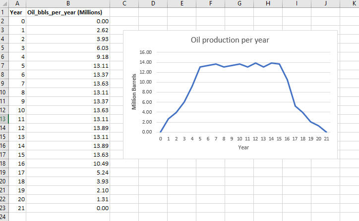
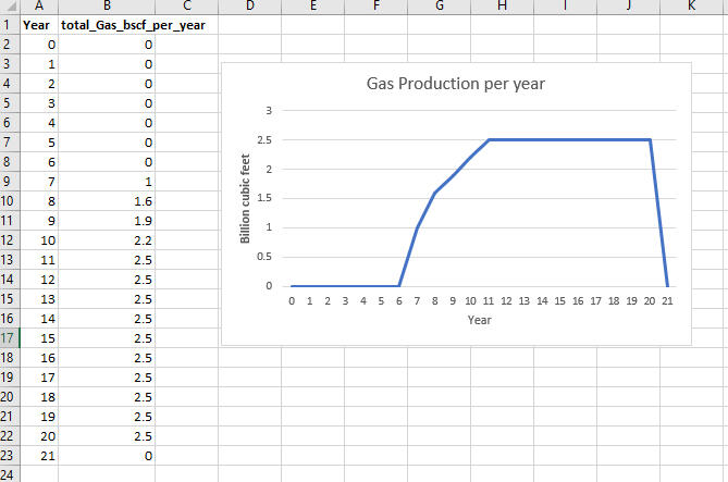
As part of the data provided by the team of experts, I used the transpose function in Excel to copy and paste the production profiles of oil and gas data into my 'calculation' sheet to give the Total Production (TP) (shown below).
PS: Due to the random variables identified in the input section, my dynamic computation done above allows the computed values to keep changing to reflect changes in real-life situations.
Building The Dynamic Model
Under the "calculation sheet" in my Excel workbook, I used the transpose function to transfer the production profiles for 'oil' and 'gas' into my calculation sheet to avoid transmission errors that could arise from manual input. This is useful due to the different orientations of these sheets. The production levels for 'oil' and 'gas' are reproduced in rows 6 and 7, respectively.In order to compute the NPV of our project, I need the two main components: cash inflows (revenues) and cash outflows (expenditures).
The Total Revenue (TR) is the product of Total Production(TP) and the Price (P) we get from selling these outputs (i.e., TR = TP * P). This formula is used to calculate the Oil Revenue and Gas Revenue on rows 9 and 10 and their sum give the Total Revenues on row 11.By taking the Total Expenditures from the Total Revenues, the result is the Profits of the firm for all the years of production. These yearly profits represent the net cash flows for the firm in each year. To account for these net cash flows in money-of-the-day terms, they are discounted to their Present Value using the discount rate (30%) specified earlier. The result is the Net Present Value of this investment. This is how much the investment would be worth in terms of today's money.
The Monte Carlo Simulation
To account for any deviations that could result in our NPV value, a Monte Carlo Simulation (as explained earlier) is conducted. The Monte Carlo method makes the model more robust by incorporating the volatility of the stochastic variables. The key drivers of the possible risks were identified as our stochastic variables under our variable descriptions, which are the result of various factors, including but not limited to inflation and geopolitical factors.The chart below is a sampled snapshot of the simulation of the key variables. This advanced scenario analysis conducts 10,000 trials using the random variables that have been calculated. The MC model is significant because it accounts for variations in these stochastic variables over several scenarios to assess how sensitive the project could be in response to their changes. This helps to inform strategic decisions because it incorporates all possible risks and uncertainties that could likely affect profitability.PS: Excel is limited in the number of iterations that can be done and cannot handle huge amounts of data. As a practice in the energy industry, Crystal Ball software is normally used to make this analysis seamless. However, in this project, I decided to use Excel for all tasks.

Key Insights from the Simulations
Descriptive statistics and charts resulting from the model would be used to inform decision-making. A sensitivity analysis will also be carried out to understand all possible changes.Results Overview
Note that the results presented are just static representations of dynamic results in the model.

Average NPV: $342 Million
Range of NPV (95% confidence): $337 Million - $348 Million
Best-Case Scenario: $1.2 Billion
Worse-Case Scenario: -$231 Million
Probability of success (NPV > 0): 93%

Breaking Down Statistics ResultsUnder the base case scenario (i.e., assuming all our estimated variables remain the same as estimated), the summary statistics results give the most likely outcome of Transition Energy's profitability after considering 10,000 iterations of possible variations.The results show that using a 30% discount rate over the expected life of the project, the estimated average NPV is about $342 million. Using the extreme cases of possible changes in the stochastic variables as stated above, there is about a 93% chance that the project will return a positive profit of up to $1.2 billion. This means there is only a 7% chance of the project generating negative NPV in the worst-case scenario, which is about -$220 million (loss).These results are also graphically presented in the chart, where the probability distribution of negative NPV values (only the first 4 bars on the left) are relatively insignificant compared to the positive NPVs (to the right).Given the base price and cost distributions provided from the beginning, there is 95% confidence that the NPV will fall between positive values of $337 million and $348 million.Now considering all the variables in the model, the margin of error from my computations was just 0.5%, which makes the level of accuracy in these predictions very high. The closeness of the computed mean values to the estimated input values (produced from the 'stakeholder engagement' in the early stages) further confirms confidence in the results, with 95% certainty.Key Risk Drivers:
To rank the risk factors for this project, we can also infer from the standard deviation results in the output. The deductions made from the result indicate that the cost factors had higher chances of affecting the project's earnings than the revenue components.Put simply;
Decommissioning costs showed the highest variability, significantly affecting NPV in extreme cases (standard deviation = 67.58).
Operations costs exhibited a higher chance of affecting the NPV (standard deviation = 17.31).
Oil price volatility had a high but relatively moderate impact, reflecting global market uncertainties (standard deviation = 13.82).
Gas prices had comparatively lower volatility (standard deviation = 1.29).
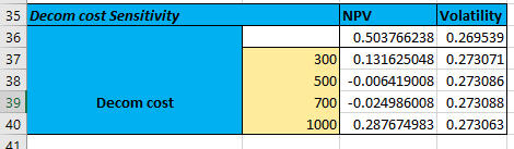
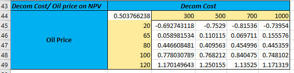
Sensitivity Analysis: Testing The Limits
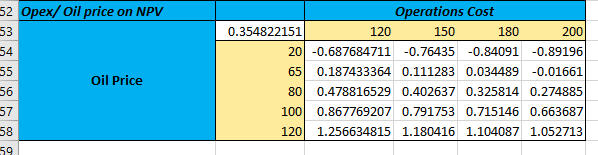
To further evaluate the robustness of the project and avoid any unforeseen circumstances that would affect the model's predictions, I tested the possibility of extreme scenarios through a sensitivity analysis. To achieve this objective, I altered the key variables identified as highly volatile in my base case results.These alterations were based on empirical and historical trends and assumptions. Since lower revenues and/or higher costs adversely affect NPV, this analysis sought to assess how profitability could be affected if prices fell and/or the costs increased. The following scenarios were tested, and the results are presented in the charts below:
Oil Price drops to a minimum of $20 per barrel; Most likely Price of $80, and would not increase beyong $120 due to increasing demand for cleaner energies.
Gas Prices are assumed to remain the same as the base case scenario.
Decommissioning costs spike to $1 billion. This is due to the high demand for decommissioning assets soon when renewable energy adoption forces oil and gas companies to cease production before their expected life ends.
Operational costs reach $200M annually due to the high cost of labour and operations due to regulatory policies in the near future.

Under these conditions, the project's probability of success dropped from 97% (under base case) to 79%, with a revised average NPV of $265 million. This shows that, despite the increased risks, the project remained viable in most scenarios with a 95% probability that the NPV would fall between $258 million and $271 million.
Conclusion and recommendationImplications and Detailed AnalysisProfitability with Caveats
Base-Case Viability:
The simulation indicates an average NPV of approximately $342 million with a tight confidence interval (roughly $337M–$348M). This suggests that—under normal or base assumptions—the project is economically attractive.Downside Risk:
Despite this optimistic mean, the worst-case scenario shows an NPV as low as -$220 million. Although the probability of negative NPV is around 7% in the base case, sensitivity analyses reveal that adverse conditions (e.g., steep drops in oil prices or spikes in decommissioning costs) can increase the probability of a loss significantly (up to 21% under stressed conditions).Decommissioning cost has the potential to erode profits drastically, whilst a significant downturn in oil prices can tip the balance from profit to loss, as oil revenue is a major driver of the overall NPV. Although operational expenses are modelled with a uniform distribution between $120M and $180M (and up to $200M in stressed scenarios), their cumulative effect over the production life further intensifies the risk, especially when paired with adverse movements in other variables.
Scenario analysis

scenario analysis

Scenario Analysis
The Interplay of Variables
1) Compound Risk:
The sensitivity analysis illustrates that the interplay between market risk (oil prices) and cost uncertainties (especially decommissioning) can have a compounding effect. For instance, even if oil prices remain moderately high, an unexpected surge in decommissioning costs could still drive the NPV into negative territory.2) Discount Rate Significance:
A 30% discount rate, reflective of the high-risk energy environment, magnifies the sensitivity of the project to future cash flows. This emphasizes the need for very robust revenue and cost management strategies.
Broader Industry Implications
1) Market Volatility:
The energy sector today is characterized by rapid fluctuations in commodity prices due to geopolitical tensions, shifting demand patterns, and a global push for sustainable alternatives. This project exemplifies how even well-planned investments can be vulnerable to external shocks.2) Regulatory and Environmental Pressures:
Increasing regulatory scrutiny, particularly around decommissioning and environmental impacts, further adds uncertainty to cost estimates. Companies are now required to incorporate more stringent ESG (Environmental, Social, and Governance) criteria, which could lead to higher compliance costs.3) Technological and Operational Efficiency:
The simulation underscores the necessity for real-time data analytics and adaptive operational strategies. In an industry where technology is evolving rapidly, maintaining operational efficiency is not just cost-effective—it’s essential for risk mitigation.
What It All Means: Insights and RecommendationsKey Takeaways:
With an average NPV of $340M and a 93% chance of success, the project is economically feasible.
Transition Energy Ltd should hedge against decommissioning costs and oil price volatility using financial instruments or cost management strategies.
Even in extreme conditions, the project shows promise, though risks remain. Risk, they say, cannot be eliminated but can be diversified or transferred. Exploring various risk mitigation strategies is the key to achieving optimal success.The NewFoundLand project symbolizes the challenges and opportunities of today’s energy sector. By leveraging sophisticated tools like Monte Carlo simulations, Transition Energy Ltd can confidently chart its course, balancing risk and reward.To decision-makers, investors, and industry pioneers: this is our chance to innovate and lead. Together, we can make informed decisions that secure energy supplies for future generations. Let’s navigate uncertainty—one project at a time.
In-Depth Recommendations
Based on the above analysis, the following strategic recommendations are proposed:A) Risk Mitigation Strategies
1. Financial Hedging Instruments:
- Oil Price Hedging: Leverage futures, options, and swaps to protect against steep declines in oil prices. Establish fixed-price contracts where feasible to stabilise revenue forecasts.
- Decommissioning Insurance: Explore specialised insurance products or contractual arrangements that lock in decommissioning costs, thereby reducing uncertainty.2) Cost Management and Operational Efficiency:
- Enhanced Cost Controls: Implement advanced cost tracking systems to monitor operational expenses in real-time. Use predictive analytics to flag potential overruns before they materialise.
- Lean Operations: Invest in process improvement initiatives and lean management techniques to minimise waste and inefficiency across the project lifecycle.
B) Scenario Planning and Dynamic Modeling
1. Continuous Model Refinement:
- Establish a feedback loop to update the Monte Carlo simulation regularly with the latest market data and operational performance metrics.
- Integrate real-time market intelligence to adjust probability distributions dynamically. This emphasises the significance of using current and advanced industry software systems like Crystal Ball and ETRM systems.2. Stress Testing and Sensitivity Analysis:
- Regularly perform comprehensive sensitivity analyses to understand how variations in key inputs affect NPV.
- Develop “what-if” scenarios that include extreme events (e.g., sudden regulatory changes, geopolitical conflicts) to ensure preparedness for adverse conditions.
C) Strategic Diversification and Investment1. Revenue Diversification:
- Consider investing in complementary revenue streams, such as downstream processing or renewable energy projects, to hedge against oil price volatility.
- Explore joint ventures or strategic partnerships with other firms in the energy sector to share risks and capitalise on cross-sector synergies.2. Capital Allocation and Contingency Planning:
- Set aside contingency funds specifically earmarked for potential overruns in decommissioning and operational costs.
- Revisit capital expenditure plans to determine if phased investments or staged development might reduce upfront risks.
Conclusion
The detailed Monte Carlo simulation has not only affirmed the economic feasibility of the NewFoundLand prospect—with an average NPV of $340 million—but also highlighted the critical risks that must be managed. The primary takeaway for Transition Energy Ltd is that while the project is attractive under base-case conditions, its success is highly contingent on managing decommissioning cost volatility and oil price fluctuations.The recommendations provided here—ranging from financial hedging and cost control to advanced analytics integration and stakeholder transparency—are designed to mitigate these risks. They reflect the current trends in business analytics and risk management, ensuring that Transition Energy Ltd is well-equipped to navigate an increasingly uncertain economic landscape.By implementing these strategies, Transition Energy Ltd can not only safeguard their investment but also set a benchmark for smart, data-driven decision-making in the energy sector. This approach, combining rigorous quantitative analysis with strategic foresight, is essential for businesses aiming to thrive in today’s volatile market.
Final Thoughts & Call to Action
This project reinforced my ability to analyze real-world economic challenges using financial modelling in Excel. It combined critical thinking, technical expertise, and effective communication—skills that are essential for a data analyst, economist, or policy strategist.💡 Are you a recruiter, policymaker, or business leader looking for data-driven insights?
💬 Let’s connect on LinkedIn or fill the forms below to send me an email!🚀 If you’re hiring, I’d love to bring these analytical skills to your team. Let’s shape data into solutions together.
EXPLORATORY DATA ANALYSIS OF THE VOLATILITY OF OIL PRICES USING DATA FROM U.S. ENERGY INFORMATION ADMINISTRATION (EIA)

Table of content
About this Project:
This project explores the long-standing assertion that oil prices are volatile. While this is a common phrase in discussions about energy markets, the goal here is to test that claim with data rather than assumption. By combining data collection, statistical computation, and visualisation in Python, the project provides a structured investigation into the fluctuations of crude oil prices over time.

Objective of this Project:
The main objective is to quantify and illustrate the volatility of oil prices. This involves moving beyond raw price levels to examine log returns, measure price fluctuations, and visualise sharp movements caused by economic crises, supply shocks, and geopolitical events. Ultimately, the project seeks to explain why oil prices are labelled volatile and to present this evidence in a transparent and reproducible way.

The Data Used:
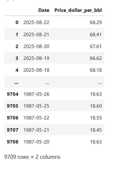
The data used in this project is sourced from the U.S. Energy Information Administration (EIA), a widely recognised and authoritative provider of energy statistics. Price data was collected into a structured pandas DataFrame for analysis, ensuring both reliability and transparency in the investigation. The data was downloaded in csv format and named as brent.csv.

Breakdown of the Analysis
1. DATA PREPARATION
A.# Import relevant Python libraries

B.# Load oil price data from IEA into pandas DataFrame# This loads my csv file into a DataFrame (df).
# I also parsed the "Date" column in the data to tell pandas to treat it as datetime. This is very necessary to avoid any doubts in situations where pandas reads the dates as different datatype.
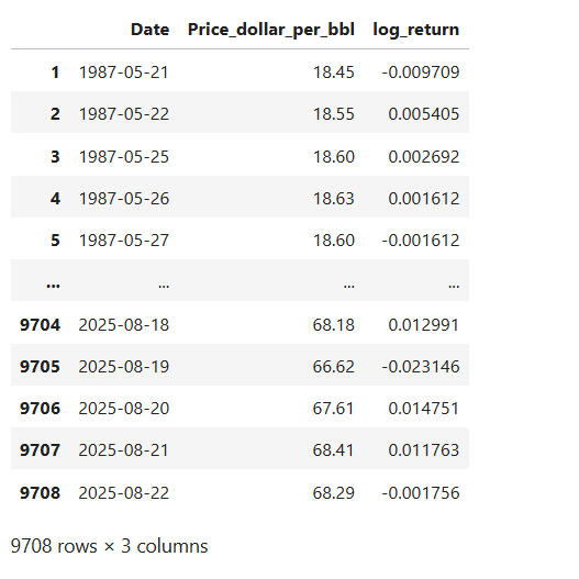
# Running the 'df' gives the DataFrame as below with 9709 rows and 2 columns; "Date" and "Price_dollar_per_bbl":

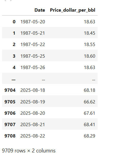
C.# Clean and format the dataset:

This sorts my data in chronological order based on "Date".
The .reset_index() resets the index to match the new order and the drop=True deletes the default index values.
Running 'df' gives us the output below:
2. METHODOLOGY
Now the data has taken shape and ready for analysis. However, as done in finance and econometric analysis, I want to investigate more than just price movements; I want to calculate the price changes.
I would want to go the extra mile to estimate the difference between the price movements from one period to the next, using "log".

I created a new column called "log_return" using numpy, which will compute the log of each price.
I used the .diff() function to find the difference between the log price at timet and the log price at timet-1.The resulting relative changes in price is ideal for detecting trends, volatility and stationarity in this time series analysis. This makes the analysis more informative than using raw price or raw price differences.
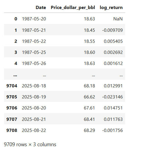
We need to clean the data and remove any null values that may distort the analysis.

The .dropna() removes rows with missing values.This is necessary because the .diff() introduced a 'NaN' in the first row since it tries to find the difference between that price and price that doesn't exist, based on the data we have.
So the .dropna() gives this clean sample output:
3. PLOTTING PRICE AND RETURNS
Using matplot library, create a 'figure' with two (2) subplots stacked vertically. Set the dimensions of the figure to 10 inches wide and 6 inches high, which is big enough to see the trends clearly.Complete<code>:

The codes specify that the first chart should plot the "raw Brent oil Price" (in dollars per barrel) over time whilst the second chart is used to show the volatility and price movement intensity over time using "Log returns", and not just price level.They are also given titles as "Trend of Brent Spot Price" and "Log returns" respectively.The .tight_layout() adjusts spacing so that the titles and the axes do not overlap.The .show() helps to render the plot.
A. VISUALISATIONS:
-First chart: Oil prices over time to show long-term trends.
-Second Chart: log return to reveal underlying volatility.
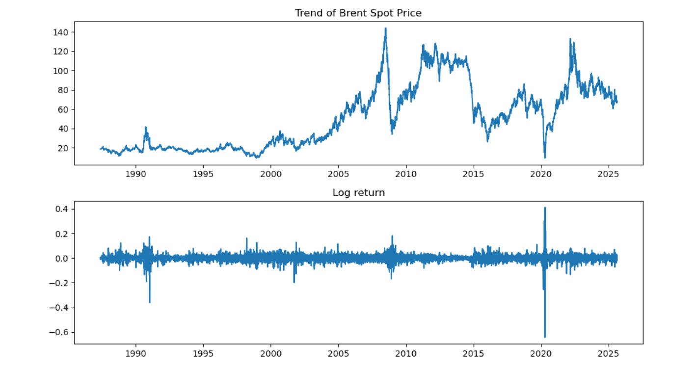
-The Price plot reveals the long-term trends in brent oil prices which could be upward, downward or even stable.
-The log-return plot reveals short-term dynamics in the oil market, which could be in the form of spikes, crashes or random movements.
B. QUICK STATS ON LOG RETURNS:

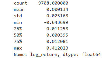
This code gives us a summary of the distribution of log return. These include: the number of data points used; the average return which can hint us of the drift in the data points; the extremes which will inform us of the biggest drops or spikes, and the general shape of the distribution.This is useful because it helps us to quantify risk, spot outliers and understand the return behavior (whether it is symmetric, skewed or stable).
4. ANALYSIS OF THE RESULTS
Generally, the interaction of demand for and supply of oil determines the price. The market for petroleum is global in nature and so the price changes are influenced by numerous factors.The resulting statistics on log returns of Brent crude oil tell a rich story about price volatility, market shocks, and the underlying structure of oil price movements over time.The two images above tell a compelling story of Brent crude oil's journey through global economic history, with the top chart showing the price evolution and the bottom chart revealing the volatility and market shocks through log returns.
A. 📉THE PLOTS

🛢️Top Plot: Brent Price Over Time
This chart is a visual timeline of global energy dynamics:
- 1987–1999: Relatively stable prices, reflecting a period of post-Cold War economic adjustment and steady supply.
- 2000–2008: There was a dramatic rise in price.
- 2009–2014: Recovery and another surge, driven by demand rebound and OPEC’s production strategies. Around 2010 and 2011, the oil price recovered strongly due to the return of confidence in the far eastern markets. The price of oil stayed above $100 per barrel for over two years from 2012 until it suffered another collapse in 2014.
- 2014–2019: A sharp drop; this was the shale revolution in the United States (US) which flooded the market with supply and disrupted traditional pricing power.
- 2020: A historic crash; likely tied to the COVID-19 pandemic, when global demand collapsed and oil briefly traded at negative prices.
- 2022–2025: A rebound, possibly reflecting post-pandemic recovery, inflationary pressures, and geopolitical disruptions (e.g., war-related supply risks). A notable factor that could be attributed to the rise in oil price is the war in Ukraine and the resulting sanctions on Russian oil and gas.
In summary, this plot shows that Brent crude is cyclical, reactive, and geopolitically sensitive.
📊Bottom Plot: Log Returns (Volatility)This chart reveals the 'emotional intensity' of the market:- Spikes in log returns indicate days of extreme price movement; either panic selling or euphoric buying. The oil price has fluctuated considerably over the past 3 decades.
- 1990 spike: Possibly tied to the Gulf War, which disrupted oil supply and triggered market fear.
- 2000–2010 volatility: Reflects the financial crisis, where uncertainty gripped all asset classes. This was relatively quite short-lived but had great impact on the oil price.
- 2020 spike: The COVID 19 crash was a once-in-a-century demand shock but had ripple effects in the global oil market.
- Post-2020: Continued volatility, showing that the market hasn’t returned to pre-pandemic calm. This could be due to inflation, energy transition uncertainty, or geopolitical instability.
Log returns help analysts understand risk, not just price. They show how fragile or resilient the market is to shocks.

🧠 The Bigger Story
It is clear that together, these plots tell a compelling story of:
- Booms and busts driven by macroeconomic cycles.
- Structural shifts like shale oil and energy transition.
- Global crises that ripple through commodity markets.
- A market that is not just volatile, but deeply reactive to human events.This is why oil remains one of the most watched and traded commodities; it’s a mirror of global stability, conflict, and transformation.
B. 📊 SUMMARY STATISTICS OF BRENT CRUDE LOG RETURNS
| Metric | Value | My Interpretation |
|---|---|---|
| Count | 9,708 | Number of daily log return observations. This suggests a dataset spanning roughly 38 years of trading days (assuming ~252 trading days/year). A robust sample for time series analysis. |
| Mean | 0.000134 | The average daily log return is slightly positive, indicating a modest upward drift in prices over time. However, it's nearly zero, suggesting that most of the price movement is noise or volatility, not trend. |
| Std Dev | 0.025168 | This is the volatility of daily returns. A standard deviation of ~2.5% means prices typically fluctuate ±2.5% per day. For crude oil, this is moderate to high volatility, reflecting its sensitivity to geopolitical, economic, and supply-demand shocks. |
| Min | -0.643699 | The worst single-day log return: a 64% drop in price. This is likely tied to a major market event, possibly the 2020 COVID crash or a geopolitical disruption. Such extreme downside risk is critical for risk management and hedging strategies. |
| 25% (Q1) | -0.011258 | 25% of daily returns are below -1.1%, showing that downside moves are frequent. |
| 50% (Median) | 0.000395 | The median return is slightly positive, reinforcing the idea of a long-term upward drift. |
| 75% (Q3) | 0.012081 | 75% of returns are below +1.2%, meaning large upward spikes are less common than downward ones. |
| Max | 0.412023 | The best single-day return: a 41% surge. This could reflect a supply shock, war risk premium, or OPEC decision. These upside spikes are rare but impactful. |
🧠 Analyst Insights
🔥 Volatility Profile
- The standard deviation and range (from -64% to +41%) show that Brent crude is highly volatile.
- This volatility is asymmetric, that is, the downside tail is longer and more extreme than the upside. That’s typical in commodities where supply disruptions or demand collapses can cause sudden crashes.
📉 Risk Management Implications
- The fat tails (extreme min/max) suggest that normal distribution assumptions may not hold. This simply means that extreme events (very big ups or downs) happen more often than a standard bell-curve (normal distribution) would predict. Therefore if we assume the data is “normal”, we risk underestimating the chance of big losses or gains. That’s dangerous, because the real world shows us that markets can swing much harder than theory suggests.Analysts should consider Value at Risk (VaR) using non-parametric methods or apply GARCH models for volatility clustering. This means, instead of assuming a neat "bell-curve", looking directly at historical data patterns gives a more realistic estimate of worst-case losses. Also the fact that calm periods are often followed by calm, and turbulent periods by turbulence, the GARCH models will be able to capture “volatility clustering”.So, in plain terms: since market risk isn’t evenly spread out but comes in waves of quiet and storms, if we only rely on simple statistical assumptions, we might miss the storms. These advanced methods help us prepare better for them.- Hedging strategies like options, futures and all other derivatives must be explored to account for these tail risks.
📈 Investment Perspective
- The near-zero mean implies that short-term speculation is risky, but long-term investors may benefit from structural trends (e.g., inflation hedge, geopolitical premiums).- The positive skew in the upper quartile suggests occasional rallies, often tied to macro events.
🛢️ Energy Economics Context
Oil prices are influenced by demand and supply determinants including:
- OPEC decisions
- Geopolitical tensions
- Global demand cycles
- Technological shifts (e.g., shale boom)
- Environmental policy and energy transitionThese log return stats are a fingerprint of how all those forces have played out in the market.
5. CONCLUSIONThis analysis of Brent crude oil price movements reveals that market volatility is not merely an abstract concept, it's a measurable phenomenon with profound implications for risk management and investment strategy. By leveraging Python's analytical capabilities, I've transformed raw price information into actionable insights about market behaviour and risk.
The standard deviation and the wide range metrics reveal a Brent crude's distinctive signature of approximately 40% annualised (~252 trading days) volatility. This underscores crude oil's position as a high-risk asset class, with price movements reflecting complex global dynamics ranging from geopolitical tensions and supply disruptions to macroeconomic shifts and technological disruptions. Our rolling volatility analysis further identified distinctive market regimes, with volatility clustering around major global events such as the Gulf War, the 2008 financial crisis, and the 2020 pandemic.
Value of ProjectThe value of this approach extends beyond academic interest:
-For investors: Understanding these volatility patterns enables more sophisticated risk management and hedging strategies. By incorporating volatility metrics into valuation models and portfolio construction, sound investment decisions can be made with some level of certainty.
-For policy makers: Quantifying market responses to historical events provides a framework for anticipating future shocks.
-For energy firms: These insights can inform capital allocation decisions in an increasingly uncertain energy landscape.
Further Research:Looking ahead, this analysis forms the foundation for more advanced applications, including:-Predictive modelling of price movements using machine learning algorithms.
-Scenario-based stress testing for energy portfolios.
-Integration with fundamental analysis for comprehensive market insights.
-Risk measurement frameworks tailored to energy commodities.By quantifying what was previously understood only qualitatively, we've demonstrated how data science can transform our understanding of energy markets, thereby bridging the gap between technical analysis and practical decision-making in this vital sector. In a world where energy markets increasingly reflect both traditional supply-demand dynamics and emerging transition pressures, these quantitative tools become not just useful but essential for navigating complexity and uncertainty.
In the early 1980s, OPEC's production decisions had great influence on price of oil but some members were extremely reliant on oil revenues for their budgetary requirements which led to cheating among the cartel.For instance, from 1981 to 1985, Saudi Arabia, being a lead member took most of the burden by reducing its production dramatically. At the same time, other members secretly sold at discounts and engaged in other forms of cheating. Saudi Arabia could no longer tolerate this and so also started to increase its production to regain market share. This caused prices to fall and even reached a low point of $10 by 1986.OPEC had lost cohesion and so in 1987 to the 90s, the market makers (the traders- refiners, speculators alike) were rather suspicious of the quotas made public by OPEC. At some point, OPEC admitted that the information to the public of their production capacity was less than its actual production.By 1998, the far east, which was the engine of growth in global demand for oil products had experienced bank crisis which reduced global demand. It was around the same time that OPEC had announced an increase in their production by approximately 2 million barrels per day. This therefore had no significant effect on the price of oil at the time and prices remained at around $10 per barrel.
This era was characterised by rapid industrialization in the far east (especially in China which recorded growth at record levels of almost 10% per annum). At the same time, there were increased supply disruptions from countries like Iraq and Venezuela which meant that most of the oil required to meet this demand could not find its way to the market. These, coupled with the increasing geopolitical tensions, caused a lot of volatilities.For instance, oil price fell below $30 per barrel in 2000 and steadily rose to $60 per barrel by 2007 before finally climbing rapidly to almost $140 per barrel in the summer of 2008 just before the global financial crisis. Over these periods, the consumption of oil globally grew consistently apart from the slight decline from 2008 to 2009, at the height of the crisis. At this point, other commodity prices apart from oil prices were rising so speculators entered the market which helped to boost the price of oil. This oil price boom burst in the summer of 2008, when the global financial crisis led to the collapse of many commodity markets and prices.
By 2014, the US was the third largest oil producer in the world after Saudi Arabia and Russia.
The price of oil experienced a sudden drop from over $100 per barrel to $50 per barrel in a space of 6 months, and then a further fall from $50 to approximately $30 per barrel at the start of 2016. The price regained strength until it reached $80 per barrel in the third quarter of 2018. By the first quarter of 2019, the price of oil was around $65 per barrel.Shale oil production requires new technologies that are so expensive that the price of oil needs to be at least $50 per barrel to generate a profit. Thus, with prices above $50 per barrel, the US oil industry largely embraced this technology, and new companies have began to spring up rapidly in key parts of the country to undertake these fracking activities. This technology enabled wells to be drilled within a short period of time contributing to a shorter investment and project lifecycle, thereby allowing investors to get returns very quickly.This dramatic growth in oil production from the US was a threat to OPEC. In a bid to retain their market share, the OPEC countries, particularly Saudi Arabia, increased their production at the time when shale production was at the peak in the US in 2014, causing oil prices to fall. This price fall caused the US supply to fall sharply, until it rose again in 2017 when the price passed $50 per barrel.By 2015, OPEC's decision to boycott production quotas to regain market share had taken full effect and this caused the price to collapse further and for 2 years we had a free market. This created competition among OPEC members and with non-OPEC members. In 2015 and 2016 prices were very low. By late 2016, the crown prince of Saudi Arabia who played a key role in the oil policies had different ideas on what the policies should be. The group, led by Saudi Arabia, agreed to cut production so that price of oil would go up and there was consensus.These cuts took effect in 2017 with Saudi Arabia taking the major cut. Some non-OPEC members like Russia and Oman also agreed to collaborate with the production cuts. By 2018, the price had risen significantly which could be attributed in part to the OPEC decisions and some unplanned production cuts by some countries like Venezuela.
The big spike starting around August 1990 and going into early 1991 took place when Saddam Hussein invaded Kuwait. This stopped the flow of oil from Kuwait into the market. UN sanctions against Iraq then kicked in, causing Iraq's oil to be taken off the market as well. There were a lot of speculations about what was going to happen next. Traders and refiners became worried that price would continue to rise, especially after the public statement by Sheik Imani, the very influential Saudi oil minister, and the world bank's study about prices going up to between $60/bbl and $100/bbl if the US army came in. The US army didnt invade in January 1991 and this brought the price down again after the spike which was caused by these fears. Later, when the US started fighting in Iraq, it was already clear quite early on that the risk of Saudi oil fields being hit or damaged was negligible, so prices were not much affected.
🚧 Project Status: Work in Progress
This dashboard is still evolving! I’ve shared this "work in progress" here to:
Showcase core data analysis and visualisation skills.
Demonstrate how these capabilities can apply to any industry.
Invite feedback and continuous learning.
🚧 What this project is about:
This comprehensive project involves an end-to-end process of building a Power BI dashboard for pizza sales analysis, starting with data import and transformation using MS SQL Server and Power Query Editor.It details the creation of key performance indicators (KPIs) such as total revenue and average order value using DAX, along with various interactive visualisations. The project progresses through designing charts like daily and monthly sales trends, percentage of sales by pizza category and size, and funnel charts for pizza quantity sold, culminating in a detailed analysis of top and bottom-selling pizzas. Throughout the process, the importance of validating Power BI results against SQL queries is emphasized, along with instructions for formatting and enhancing the dashboard's visual appeal.
📬 Let’s Connect!Thank you for visiting and if you're looking for a data-savvy problem solver, or want to collaborate, feel free to reach out!
💬 “Data doesn't speak for itself — but with the right dashboard, it tells a powerful story.”
The project defines five key performance indicators (KPIs) to provide an overall understanding of the business, and I used filters to highlight these KPIs for deeper insights into business performance.
Project KPIs

The client's KPI requirements are explicitly defined and I will include calculations for each:1. Total Revenue: This KPI represents the sum of the total price of all pizzas ordered. It gives an aggregate measure of all sales.
2. Average Order Value: This is calculated by dividing the total revenue by the total number of orders. It indicates the average amount spent per order.
3. Total Pizza Sold: This KPI is the sum of all quantities of pizzas sold. It provides the total number of individual pizzas purchased.
4. Total Orders: This represents the total number of distinct orders placed. It counts unique order IDs to avoid duplication if multiple pizzas are in one order.
5. Average Pizzas Per Order: This KPI is calculated by dividing the total number of pizzas sold by the total number of orders. It shows the average number of pizzas included in a single order.These KPIs are displayed prominently at the top of the Power BI dashboard using a new card visual in power BI, providing a high-level aggregation of values for the business.
How I Used Filters To Highlight KPIs for Insights
While KPIs offer an overall business idea, filters enable users to deep dive and see how the business is performing at a specific granularity, helping to uncover actionable insights. I used several types of filters that interact with the KPIs:Top Filters (Slicers):
-Pizza Category Filter: This allows users to select specific pizza categories (e.g., chicken, classic, Supreme, veggie). When a category is selected, all KPIs dynamically update to reflect the performance only for that chosen category. For example, a user can see the "Total Revenue" generated by "Classic" pizzas or the "Average Order Value" specifically for "Chicken" pizzas. This helps in understanding the popularity and sales performance of different pizza categories and their contribution to overall sales.-Date Range Filter: Users can input a start and end date using a calendar or a slide rail. Applying a date range filter changes all KPIs to show data only within that specific time frame. This is critical for understanding daily, weekly, or monthly trends, identifying peak seasons, or analysing performance during promotional periods. For example, the "Total Orders" KPI can show how many orders were placed in a particular month like July or January, helping identify peak months.
How I Used Filters To Highlight KPIs for Insights
Action Filters (Interactive Filters):
-The dashboard also incorporates interactive elements where clicking on specific visuals acts as a filter, dynamically updating the KPIs. For instance, clicking on a bar in a column chart (e.g., for "Sunday" or "Friday") or a segment of a donut/pie chart (e.g., for a "Classic Pizza" category or "Large" pizza size) will filter the values across the entire dashboard, including all KPIs. This allows for granular analysis, such as viewing "Total Revenue" for "Sunday" orders only, or "Average Pizzas Per Order" specifically for "Large" pizzas.-Drill down filters were also used. Adding a drill-down feature to the daily trend bar chart helped to transform the dashboard from a static summary into an interactive decision-making tool. By clicking on a specific day, users can instantly see the breakdown of pizza categories sold, offering deeper insights into customer preferences on that particular day. This is especially valuable for highlighting KPIs such as sales performance, customer demand patterns, and product mix efficiency. For instance, managers can quickly identify whether high weekend sales are driven more by premium categories like Supreme or by volume-heavy options like Classic. This level of detail makes the project more actionable, as it not only shows when sales peak but also what drives those peaks, empowering both technical analysts and business stakeholders to make smarter, data-driven decisions.
Impact on Insights:
The dynamic nature of these filters allows users to:
-Identify patterns and fluctuations: By filtering by date, users can observe patterns in orders on a daily or monthly basis, revealing peak times or seasons.-Understand popularity and contribution: Filtering by pizza category or size helps to understand which types of pizzas are most popular and how much they contribute to total sales. For example, the project highlights that "Classic category contributes to the maximum sales" and "Large size pizza also contributes to maximum sales," insights derived from filtered data.-Support business decisions: By providing granular and context-specific KPI data, filters enable business owners to make informed decisions, such as focusing on best-selling items, implementing marketing actions, or even discontinuing underperforming categories. For example, insights from top/bottom sellers by revenue or quantity (which are dynamic based on filters) can inform discount strategies or menu changes.
insights from analysis of the Regional energy consumption trend in the United Kingdom

Problem Statement: Exploring the regional energy consumption trends in the UK to identify opportunities for increased efficiency and sustainability. Highlight regions with the highest potential for renewable energy adoption.
Introduction
The United Kingdom has been ambitious in the race to achieve net-zero emissions by 2050. With this bold vision of net zero targets came the establishment of the Great British Energy, headquartered in the energy capital of Europe—Aberdeen. These goals have stirred debates among academics and industry players about whether the UK's net-zero ambition has outpaced reality.Now, kindly buckle your seat belts and join me on a journey across the UK, where the energy landscape tells the story of tradition and transformation. Our goal is to reveal the untapped potential for renewable breakthroughs that remain hidden within the familiar consumption patterns of the regions.As the energy landscape continues to evolve, it remains very crucial for investors and policymakers to understand the consumption trends to make informed decisions about renewable energy adoption.The energy trilemma—affordability, sustainability and security—continues to impact the transition to fully green energy sources, especially when this fight is not given the same level of prioritisation on a global level. This project does not only highlight my passion for sustainability and the need to achieve net zero but also demonstrates my expertise in data cleaning, integration, and visualisation using tools like Excel, SQL, and Power BI.As we explore the data today, I encourage you to picture each region as a chapter in this unfolding narrative—a tale of challenges met with opportunity, where every kilowatt-hour holds clues to a more efficient and sustainable future. Let us uncover these patterns together and see whic areas are poised to lead the energy revolution in the UK.
Data Collection & Tools UsedData Sources
To construct a comprehensive view of the UK’s energy landscape, I sourced data from several reputable, publicly available datasets:1. Annual Energy Consumption Data:
This dataset, the Energy Consumption in the UK (ECUK), was obtained from the UK Government’s Energy Statistics repository. It provided detailed annual figures from 1970 to 2022, including both unadjusted and temperature-corrected energy consumption values, along with disaggregated data by fuel type (solid fuels, petroleum, gas, bioenergy, and electricity) and by sector (industry, transport, domestic, and services).2. Regional Consumption Data:
For subnational analysis, I collected regional consumption data provided by the Department for Energy Security and Net Zero (DESNZ) that detailed energy use by region. This dataset included fields for sectors like domestic, transport, and industrial consumption as well as fuel-specific breakdowns, such as coal, petroleum, gas, electricity, and bioenergy. This allowed for a granular look at how energy is used across various regions.3. Renewable Energy Planning Database (REPD) Data:
This dataset1, 2, by the Department for Business, Energy and Industrial Strategy (DBEIS), which contained data on renewable energy projects, was used to understand the regional trends and their respective renewable energy capacity. This dataset provided key information about each project, such as the site name, technology type (e.g., biomass, energy from waste, wind offshore and wind onshore, etc.), installed capacity, operational status, and geographical location (region, county, and country).PS: Other relevant sources of data for confirmation can be found here and here.
Tools and Technologies
To transform the raw data into actionable insights, I employed a multi-tool approach:Excel:
Used for initial data cleaning and transformation. Pivot tables, sorting & filtering, and Find & Replace functions were essential for handling the metadata, standardising column names, and identifying inconsistencies across the datasets.MySQL:
Enabled robust data integration and validation. I wrote SQL queries to merge the datasets, perform group aggregations, create mapping tables for standardising region names, and validate data integrity through calculated checks.Power BI:
Served as the visualisation and dashboarding tool. In Power BI, I built interactive visuals such as bar charts, maps, and line charts, along with advanced DAX measures to convey renewable adoption rates, energy deficits, and consumption trends over time.
Data Cleaning & Integration1. Initial Data Assessment
Excel Exploration:
I started by opening the raw datasets in Excel. Each dataset presented its own set of challenges: metadata rows, inconsistent column headers, and varying formats. For instance, the Annual Consumption Data had extra header rows and verbose labels that needed simplification, while the Regional Consumption Data required careful removal of metadata and standardisation of regional names.Identifying Key Fields:
I noted that for the REPD dataset, critical fields such as installed capacity, operational start date, and construction start date sometimes contained missing values. Likewise, the Regional Consumption Data needed consistency in how regions were named, since this would be vital when merging with the REPD dataset.
2. Cleaning Each Dataset in Excel
Annual Consumption Data:Step 1: Removed extraneous rows and metadata to isolate the actual data.
Step 2: Standardized column names (e.g., converting long names to “Year,” “Unadjusted Consumption,” etc.).
Step 3: Verified totals by ensuring that the sum of sectoral consumption matched the overall totals.
Pivot Table Use: Created pivot tables to aggregate consumption by year and fuel type, which helped spot outliers and missing values.
Regional Consumption Data:
Step 1: Deleted metadata rows and removed unnecessary columns, keeping essential fields like regionalcode, region, localauthority, domesticconsumption, transportconsumption, industryconsumption, and totalconsumption.
Step 2: Standardized column names (e.g., “All fuels: Domestic” was renamed to “domesticconsumption”).
Step 3: Used pivot tables to cross-check that the sum of domestic, transport, and industry consumption matched the reported total consumption.
Step 4: Reviewed fuel-specific columns to ensure consistency and flagged any missing values.
REPD Data (Renewable Projects):
Step 1: Removed non-critical columns such as detailed planning notes.
Step 2: Standardized text entries in technologytype by replacing variations (e.g., “Biomass (dedicated)” vs. “Biomass (co-firing)”) with a single term, “Biomass.”
Step 3: Identified missing values in key fields like installed_capacity and date fields. For missing capacities, I considered imputation (using the median value for similar technology types) or, if too critical, excluding those records.
Step 4: Standardized regional information by creating a mapping table (in Excel and later in MySQL) to align names between the REPD dataset and the Regional Consumption Data.3. Data Integration Using MySQL
A) Merging Datasets:
With the cleaned CSV files from Excel, I imported the data into MySQL. I created tables for each dataset and a separate mapping table to standardize region names.Region Mapping:
I created a mapping table to reconcile differences in region names (e.g., “South Glamorgan” vs. “Wales”).[insert sql code snapshot of mapping]Joining Data:
I then joined the REPD data with the Regional Consumption Data using the standardized region field. This allowed me to aggregate renewable capacity per region and compare it directly against regional consumption totals.
[isert sql code snapshot of inner joins]Validation:
I ran SQL queries to:- Check for missing or null values in key fields.
- Validate that calculated totals (e.g., sum of domestic, transport, and industry consumption) matched the reported totals.
- Remove duplicate entries and ensure data integrity.
Analysis & VisualisationWith the integrated dataset in hand, I imported the data into Power BI. Here’s how I transformed data into a story:- Interactive Bar and Map Visuals: I created bar charts to compare total regional consumption against renewable capacity and a map visual to highlight regional disparities. These visuals were enhanced with slicers (for year and region) to let users explore the data interactively.
- Calculated Measures: Advanced DAX measures were developed to calculate renewable contribution percentages and energy deficits. For example, the measure RenewableContribution = DIVIDE(SUM(TotalRenewableCapacity), SUM(TotalRegional_Consumption), 0) * 100 provided a clear picture of how much renewable energy contributes relative to overall consumption.
- Trend Analysis: A line chart depicted energy consumption trends over time, segmented by fuel type. This visualization helped capture the gradual shift away from traditional fossil fuels towards renewables.
Challenges & How I Overcome ThemNo data project is without its challenges. Here are some of the key obstacles and my solutions:- Inconsistent Data Formats: Different datasets had varying formats for dates and region names. Using Excel’s powerful cleaning tools and pivot tables, I standardized these values, ensuring consistency across the board.
- Missing Values: Critical fields like installedcapacity and operationalstart_date had missing values. I used a combination of imputation (using medians or averages for similar technology types) and careful filtering to address these gaps.
- Data Integration Complexity: Merging datasets with different granularities (national, regional, project-level) required careful planning. I used MySQL to create mapping tables and execute precise joins, ensuring the integrated dataset was both accurate and comprehensive.
Conclusions & ReflectionsThis project has been a transformative journey, teaching me the importance of meticulous data cleaning, the power of integration, and the art of effective storytelling through data visualization. By merging diverse datasets and revealing key insights on energy consumption and renewable capacity, I’ve not only developed technical skills in SQL, Excel, and Power BI but also learned how to communicate complex data insights in an accessible manner.Through this project, I transformed raw, fragmented datasets into a coherent, integrated view of the UK’s energy consumption and renewable energy capacity. By leveraging the strengths of Excel, MySQL, and Power BI, I not only uncovered key insights about regional energy trends but also honed my data cleaning, integration, and visualization skills.Key Takeaways for Readers:
-Data Integrity is Paramount: Even the best analysis can be skewed by poor-quality data. Rigorous cleaning and validation are essential. Learn how to source and prepare data from diverse sources.
- Integration Unlocks Insights: Combining different data sources can reveal patterns that isolated datasets cannot. This project helps to understand the process of merging datasets through standardised keys and mapping tables.
- Visualisation is Communication: A well-designed dashboard can bridge the gap between technical analysis and strategic decision-making. Discover how interactive dashboards can bring data stories to life.
- Problem-Solving: Gain insights into handling missing values and inconsistencies through practical, step-by-step methods.
Call to Action
If you’re passionate about the future of energy or seeking a data professional who can turn raw data into actionable insights, I invite you to explore this project further. Connect with me on LinkedIn or via my website to discuss how data-driven strategies can pave the way for a more sustainable future. Together, let’s harness the power of data to drive positive change.I invite you to explore this project further and see how I can turn raw data into actionable insights. Whether you are looking to drive sustainable energy strategies or seeking a data professional adept at cleaning, integrating, and visualizing complex datasets, this project showcases my ability to deliver clear, impactful results. Connect with me on LinkedIn or visit my portfolio for a deeper dive into my work.
EFFECT OF UK's ENERGY POLICIES ON INVESTMENT AND DECOMMISSIONING IN THE UKCS

Picture this: It's the year 2050. The morning sun rises over a bustling coastal city. You raise your head or open your window to see the huge platforms on the sea, and the story of how that machine helps to bring out the oil and gas you need for your car starts to come back to you. People everywhere are waking up to start their day. Families gather for breakfast; children laugh as they prepare for school. Offshore, energy platforms hum quietly, supplying the lifeblood of modern life. At first glance, it's a scene of balance, progress, and continuity.

But as the day unfolds, the cracks in this picture begin to show, and floodwaters from the previous storm still linger on the streets, disrupting commutes. Farmers in nearby regions are struggling with soil that's either too dry or too salty. Fishermen whose livelihoods once thrived now contend with dwindling stocks as the ocean's ecosystems falter. The hum of industry is louder than ever, but so too are the voices of discontent and the visible scars on the landscape.A just Transition: The Neutral Ground
"Now, imagine if we had foreseen this. Imagine if the choices made decades earlier had been different—not about choosing sides, but about coming together to chart a shared path.What if we had embraced innovation, cooperation, and sustainability before the storm clouds gathered? What if governments, industry leaders, and activists had sat at the same table to align on a vision, not for what divided us but for what connected us—a shared future on this fragile planet? What if the UK was not the only nation setting ambitious targets with the aim to achieve a global goal but all nations were aligned? What if the UK was ambitious and the world was able to achieve this global goal, but the UK now had to depend on other countries that played no role in this achievement? Yes, the questions go on and on and on.....Most developing countries remain poor because investors are afraid to invest their resources there. This is not because they are "developing countries" but due to instability in most cases. Instabilities, whether political or policy wise can hinder the flow of Foreign Direct Investments (FDI) into any country. Check out my work on the "Effect of Sovereign Credit Rating on Foreign Direct Investments in selected African countries".So the begging question is, what effect would a stricter UK policy on their oil and gas sector have on investment in the sector, compared to their global competitors? If existing firms are disincentivised to cease operations before the planned time, how would this affect the supply chain as well as Decommissioning in the UK Continental Shelf (UKCS)?The purpose of this project helps us explore these possibilities together. This work is useful for governments in policy analysis as well as private businesses in the general energy sector.Watch this space as we answer these thought provoking questions together...
More About Me
I’m a Business Data Analyst with hands-on experience in Excel, SQL, Python, Power BI, GAMS, STATA, R and Business Intelligence.I started my career in telecom sales where I analysed market data for the company. I also analysed competitor performance to ensure that our products enjoy high Intention to Recommend (ITR). I became a supervisor for a pilot project, the mobile money merchant acquirers, which is now one of the flagship products driving high revenues for the company. Afterwards, I made the leap into business operations at the Ghana Maritime Authority, handling the analysis of operational and financial data of the entire organisation with presence in 6 regions and 10+ departments, informing strategic planning and implementations. It was at this point that I realised how important data was at the heart of every organisation and my love for analysis of data grew tremendously.Even though Excel was sufficient for the work at the Ghana Maritime Authority, I took charge of my development by learning SQL, Power BI, and Python to become a leader in the field. I championed the automation of the company’s business processes, designing structured data collection forms, using Python to automate transmission, and implementing an Extract, Transform, Load (ETL) workflow to consolidate data into Excel and SQL, which was then visualised in Power BI for accurate reporting and board presentations. This approach eliminated delayed reports and minimised errors in data transmission. In my role as the data analyst, I leveraged data to identify trends in maritime security, helping the organisation reduce piracy, armed robbery, and bunkering incidents. By sharing actionable insights with leadership and external stakeholders, I strengthened decision-making and improved safety across the maritime sector.While working at the Ghana Maritime Authority, I went on to pursue a Masters degree in Business Administration (Finance) to ensure I understood the underlying factors behind the numbers I worked with daily. Just before I completed my MBA, I won a scholarship to pursue MSc in petroleum, Economics and Finance at the University of Aberdeen, UK, where I was exposed to the world of energy and how data shapes this massive driving force behind economic growth.Over the past few months, I have tackled personal projects head-on, adapting quickly to a new cultural environment and navigating challenging circumstances to build solutions from scratch, demonstrating how I harness analytics tools to solve complex business problems and deliver tangible results within deadlines. My goal in every organisation is to drive commercial and financial success, delivering measurable impact, so much so that previous employers have been reluctant to let me go.Explore my portfolio to see how I transform data into results that steer organisations toward their objectives.My Interests:
I am passionate about research and the analysis of data. I am naturally curious, and I always strive to stretch my abilities to learn new things, and so I love to work with different people especially among smart people. I am a highly motivated and result-oriented energy economist with a strong passion for sustainability.What I bring to the team:
My background combines a solid foundation in economics and finance with a strong interest in Analysis of data that create real business value and drive revenue. Throughout my career, I have honed my expertise in economic analysis, financial modelling, and risk assessment, applying these skills to evaluate the feasibility and viability of projects.I excel at tasks that involve research, analytical problem-solving, and strategic thinking, particularly when they are data-driven. These challenges are like mental puzzles for me, and tackling them with both logic and outside-the-box thinking gives me a real surge of energy.I have experience working in a team, completing time-sensitive projects within deadlines, and taking pride in delivering exceptional customer service. In every organisation I have worked with, I work hard to act as a positive role model for the company, take ownership of my professional development, and embrace change to ensure the business becomes a market leader. I am hungry to learn, want to be the best I can be and always strive to support my co-workers to achieve a common goal.Why work with me:
I'm a creative problem solver who analyses information and facts to achieve the best outcome for the team. I quickly fit into a team, act selflessly, and work hard to help my employer achieve their commercial and financial goals.I like to work on projects that have real world impact and make a difference in society, by solving problems that businesses face.Feel free to navigate through my projects, which combine the application of multiple analytical tools to showcase my versatility in data analysis.View My Resume | LinkedIn | YouTube | Email
HOSPITAL EMERGENCY VISITS ANALYSIS

Project OverviewThis project analyzes 9,216 emergency room visits over a 19-month period (Apr 2023–Oct 2024) to uncover operational bottlenecks, patient flow trends, and service-quality gaps. The dashboard enables hospital leadership to quickly assess patient demand patterns, monitor wait-time performance, evaluate satisfaction scores, and identify high-pressure time windows that require additional staffing or resources.
Tools & Technology Used:- Power BI – dashboard design, KPI development, report structuring, storytelling.
- Power Query – data ingestion, transformation, cleaning.
- DAX (Advanced) – calculated measures, time-intelligence, categorical groupings, KPI logic.
- Data Modeling – relationships, date table construction.
- Interactive Dashboard Design – multi-page navigation, slicers, drilldowns.
Dataset OverviewThe dataset covers 9,216 unique ER patients across 19 months and includes demographic, clinical, and operational metrics:- Demographics: Age, Gender, Race
- Operational Metrics: Admission Date/Time, Wait Time, Department Referral
- Outcomes: Admission Status, Satisfaction Score
- Administrative: Case ManagerThis breadth allows for comprehensive analysis spanning patient behavior, service delivery, scheduling, and demand forecasting.
Problem Statement“How can hospital leadership optimize staffing, improve wait-time performance, and better understand patient demand patterns in the Emergency Room?”The goal was to transform raw patient-level data into clean, structured insights that support data-driven decision-making around resource allocation and service improvement.
Approach & MethodologyA. Data Import & Validation- Imported raw CSV file into Power BI
- Validated row/column counts and ensured all data types were correctB. Data Cleaning (Power Query)- Created a Patient Full Name field using custom column logic
- Standardized gender labels by replacing abbreviations
- Performed column quality and distribution checks to identify errors and blanks
- Resolved formatting issues across date, numeric, and categorical fieldsC. Time-Intelligence Preparation- Built a dedicated Date Table using:Date Table = CALENDAR(MIN(admission_date), MAX(admission_date))- Added Month, Year, and Month Number fields for hierarchical time analysis
- Sorted Month Names dynamically using Month Number
- Established relationship between Date Table and admission date fieldD. Feature Engineering & DAX MeasuresCreated analytic-ready calculated fields and measures including:- KPI Metrics:
- Total Patients → DISTINCTCOUNT(Patient ID)
- Average Wait Time
- Satisfaction Score
- Number of Department Referrals (excluding “None”)
- Patient Admission Status:Categorized as “Admitted” or “Not Admitted”- Age Group Buckets:Using a SWITCH–TRUE structure for age segmentation (0-9, 10-19, … 70-79, etc.)- Wait-Time Performance:Flagged visits within or outside 30-minute target- Time-of-Day Analysis:Extracted hour of admission and grouped into intervals such as “07-08”, “11-12”, “19-20”, etc.E. Dashboard Design & VisualizationDelivered a four-page Power BI report:1. Monthly View– KPIs, trends, demographic breakdowns, referral patterns, wait-time performance2. Consolidated View– Year, month, day, and hour-level analysis with slicers3. Patient Details– Row-level view for leadership to explore individual cases4. Key Insights Page– Executive summary of major findingsVisuals included bar charts, donut charts, line charts, matrix heatmaps, and KPI cards, all designed for intuitive decision-making.
Key Insights & Value Delivered1. Patient Wait Times & Satisfaction- Average wait time: ~35.3 minutes, indicating room for operational improvement
- Average satisfaction score: 4.99/10, showing moderate satisfaction and highlighting areas for enhancing patient experience2. Departmental Referrals- 5,400 patients had no referral (walk-ins or unclear needs at booking)
- Most common referrals:
- General Practice – 1,840 cases
- Orthopedics – 955 cases
- Physiotherapy – 276 cases
- Cardiology – 248 casesThese patterns help guide staffing allocation and specialty coverage planning.3. Peak Busy Periods- Busiest days: Saturday (1,377 visits), Thursday (1,332), Sunday (1,318)
- Busiest hours: 07:00, 11:00, 13:00, and 23:00These hotspots point to periods where additional staff and faster triage processes may be essential.4. Patient Demographics- Largest age groups:
- 30-39 years → 1,200 patients
- 20-29 years → 1,188 patients
- Significant representation from adults aged 40-505. Race Distribution- White: 2,571 patients
- African American: 1,951 patients
- Multi-Racial: 1,557
- Asian: 1,060
- Declined to identify: 1,030This reveals a diverse patient base with non-trivial gaps in reported demographic detail.6. Admission Patterns- 4,612 admitted
- 4,604 dischargedVirtually a 1:1 ratio, indicating a high processing load requiring balanced workforce planning.7. Summary for LeadershipThe analysis highlights high patient volumes, variable wait-time performance, moderate satisfaction, and significant referral flows to General Practice and Orthopedics.These insights support targeted actions in:- staffing optimization
- wait-time reduction programs
- specialty resource planning
- patient experience enhancement
What I LearnedThis project strengthened my ability to:- Build end-to-end analytical workflows in Power BI
- Apply advanced DAX to create interpretable KPIs and performance flags
- Construct time-intelligent models using custom date tables
- Design multi-page dashboards focused on narrative clarity and decision support
- Translate complex patient-level datasets into actionable insights for leadership
BANK LOAN PORTFOLIO PERFORMANCE ANALYSIS

Project OverviewThis project evaluates a bank loan portfolio comprising 38,576 loans with $435.8 million in capital deployed, with the objective of assessing portfolio performance, credit risk exposure, and profitability.Using KPI-driven Excel dashboards, the analysis tracks funded amounts, repayments, interest income, and borrower risk metrics, enabling clear separation of good vs bad loans and visibility into portfolio-level returns.The portfolio generated $473.1 million in total repayments, representing a net profit of approximately $37.3 million, with an average interest rate of 12.05% and borrower DTI of 13.33%.The objective was to support risk management, lending strategy, and profitability decisions using structured, transparent analysis.
Tools & Technology Used:
Microsoft Excel (Advanced) – pivot tables, calculated fields, dashboard design
Power Query & Data Modeling - KPI Structuring, Data quality and categorical derivations
Financial Analysis – loan performance metrics, credit risk segmentation
Dataset OverviewThe dataset covers 38,576 unique loan applications issued from January 2021 to january 2022 with 25 columns/ fields. The dataset represents a bank loan application portfolio, where each row corresponds to a unique loan application and the fields include:- Loan Identifiers: Unique ID per application- Financial Metrics: Loan Amount, Total Payments Received, Interest Rate, Debt-to-Income (DTI)- Loan Status: Fully Paid, Current, Charged off (Bad debt)- Temporal Data: Loan Issue Dates- Borrower Attributes: Employment Length, Home Ownership- Geography: Borrower StateThe dataset supports both performance analysis and credit risk segmentation..
Problem Statement“How can a bank quickly assess loan portfolio health, identify risky segments, and track performance trends over time using a single, decision-ready dashboard?”The analysis focuses on separating profitable (good) loans from high-risk (bad) loans, while tracking funding, repayments, and borrower characteristics.
Approach & MethodologyA. Data Preparation- Used Power Query editor in Excel to import raw CSV filed with data to preserve original dataset format.- Converted raw CSV file into XLSX format and connected to PostgreSQL database to leverage the robust data management capabilities of SQL with flexible analysis and visualisation features of Excel to handle large datasets in the furure.- Structured the dataset as an Excel Table to enable dynamic pivot tables.- Validated record counts and ensured each row represented a unique loan application.B. Core KPI DevelopmentKey portfolio KPIs were defined and calculated using pivot tables:- Total Loan Applications → Count of unique loan IDs
- Total Funded Amount → Sum of loan amounts issued
- Total Amount Received → Sum of total payments received (principal + interest)
- Average Interest Rate → Average interest charged across all loans
- Average Debt-to-Income (DTI) → Mean borrower leverage indicatorAll values were professionally formatted into thousands (K) and millions (M) for executive readability.C. Time-Based Performance AnalysisTo evaluate performance trends:- Created Month-to-Date (MTD) KPIs using loan issue dates
- Filtered latest reporting month (December) for current performance
- Derived Previous MTD (PMTD) metrics using November data
- Calculated Month-on-Month (MoM) Growth using:MoM = (MTD -PMTD) / PMTDThis highlights acceleration or deterioration in lending and repayment activity.D. Loan Quality Classification (Good vs Bad Loans)
Since no direct “good/bad” flag existed, loan quality was derived from loan status:- Good Loans = Fully Paid + Current
- Bad Loans: = Charged OffA calculated column was created to classify loans accordingly, enabling:
- Loan quality distribution analysis
- Percentage contribution of good vs bad loans
- Visual comparison using doughnut chartsE. Segmentation & Risk AnalysisThe portfolio was further analyzed by:
- Geography: Loans by state (map visualisation)- Employment Length: Risk distribution by job stability- Home Ownership: Mortgage, Rent, Own (tree map)Long-Term Trends: Loan quality evolution over timeDuplicate pivot tables were used where necessary to enable map visualisations.
F. Dashboard Design
Two dashboards were delivered:1. Summary Dashboard
- High-level KPIs
- Good vs Bad loan breakdown
- Portfolio health snapshot

2. Overview Dashboard
- Geographic distribution
- Borrower segmentation
- Trend and performance analysis

Slicers were added for intuitive filtering and interactive exploration.
Key Insights & Business ValueKey Financial & Risk Insights
- The bank issued 38,576 loans totaling $435.8M, generating $473.1M in total repayments, resulting in a net portfolio profit of ~$37.3M.
- Good loans accounted for 86.18% of total loan volume (≈33.2k customers), representing $370.2M in issued capital and $435.8M in repayments, indicating strong portfolio performance and pricing effectiveness.
- Bad loans represented 13.82% of total loans (≈5.3k customers), with $65.5M issued but only $37.3M recovered, highlighting a material credit risk exposure.
- The average interest rate of 12.05% and DTI of ~13.33% suggest relatively conservative borrower leverage, supporting overall portfolio sustainability.
- Loan quality segmentation enables targeted risk mitigation by identifying borrower segments and regions contributing disproportionately to defaults.
Business Value1. Loan Portfolio Health
- A clear distinction between performing and non-performing loans enables rapid risk assessment
- The majority of loans fall within the good loan category, supporting portfolio stability2. Credit Risk Exposure
- Charged-off loans cluster within specific borrower segments
- Employment length and home ownership show meaningful correlation with loan performance3.Financial Performance
- Total amount received provides visibility into actual returns, not just issued capital
- Interest rate and DTI analysis highlight pricing and affordability dynamics4. Geographic Risk Concentration
- Certain states show higher loan concentrations, helping identify regional exposure risk5. Executive Decision Support
The dashboard enables leadership to:
- Monitor portfolio health at a glance
- Adjust lending criteria proactively
- Strengthen risk controls
- Improve capital allocation strategies
What I LearnedThis project strengthened my ability to:- Translate financial datasets into risk-focused insights
- Build bank-ready KPIs using Excel pivots
- Derive meaningful classifications when data lacks explicit labels
- Design dashboards aligned with credit, risk, and finance leadership needs
- Communicate complex loan performance metrics clearly and concisely
Healthcare project using made up dataLet me tell you a story about my very good friend, (suggest a name that has underpinning meaning). (Name) completed first degree with first class honours, second degree in the second most prestigious university in the US and went ahead to have several certificates. He had work experience in different fields where his contribution was invaluable to the companies. In every work he had been in, it always ended up with emotions to the point where colleagues cried because he had to leave. And the management were willing to increase his salary just for him to stay. But you know one of those moments where you wish but can't? Yes, he always had to leave one way or the other because he was relocating or had to further his education on scholarship- often hard-to-choose-between opportunities.Fast forward, (name) has good certificates to his name acquired through hardwork and determination, and he has vast experience in companies where he added a lot of value. Now he is at a point in his life where he doesn't just want to work but wants a place where he can serve humanity in a more direct way due to his love for sustainability. He finds himself in a new country where he came as a scholarship student. After school he excelled in the program and is now looking for a job. The market has been very tight and his chances of getting a job in a foreign land remains elusive. He therefore decides to create his own hospital in the local community he found himself due to the school. This, he believed, would help him to directly serve people in a life changing way. He is not a doctor but his expertise in data analytics would ensure he helps the company create the best service that is of great value the community.